Friday, 13 November 2015

Film Schedule - miss georgiou


Film Schedule 

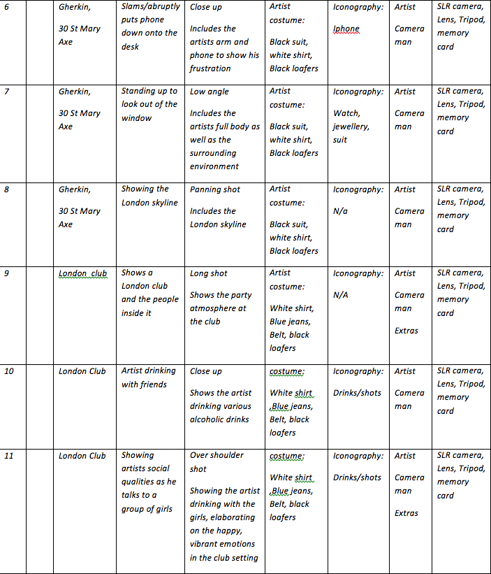
A filming schedule is vital in the production for our music video. This allows us to set out a detailed plan in relation to the different shots within the video. It allows us to plan the iconography needed, the locations, the timing, the costume, the equipment and the characters needed for each section of filming. Overall this vastly benefits the organisation and the efficiency for the filming; meaning that we can easily prepare for our filming whilst also having a valid idea into why each mice element is effective throughout the video. 


In conclusion, there were numerous changes made to our filming schedule throughout the production of our music video. For example; the entrance to the building in the office secene was discarded due to the large amounts of security in the building, the coffee scene was also discarded due to its lack of relevance to the genre, the date scene was missed out due to its lack of pace in relation to the music and numerous close ups were added throughout the progression of the filming in order to portray the artists impressive materialism and add to the variety of shots within montages in the video. The specific close ups added consists of shots of whisky, drinks at a club and parts of the artists impressive car. We also added long shots of London scenery in order to elaborate upon urban themes and the urban nightlife. After the production process, the importance of the filming schedule became clear to me. It evidently clarifies the order to the filming itself whilst also showing the details needed within each shot allowing us to carefully consider all of the micro elements. It can also be said that the filming schedule benefitted my development as a producer by setting out the vast majority of shots and techniques that were needed for the video itself. This variety shows my creativity as I have used such specified micro elements throughout in order to effectively convey elements of the narrative and conventional aspects of the genre towards the target audience. 

Monday, 9 November 2015

Planning Magazine advert - Miss Miller

The key purpose of a magazine advert is to promote an artist’s album
in order to reach a wider target audience of people who both read the magazine as well as listen to the music. It aims to act as a constant reminder of the upcoming album by appearing over a wide media spectrum. It is also used to link in with other advertisements of the album such as record labels or websites to create more marketing for the artist. Finally, it may also be used to link in with any articles within the magazine on the artist such as an interview or published scandal; this can be seen to benefit the magazine as well. The advert is specifically used, however, to develop a presentation of the artist that will appeal to a target audience for the genre; this is achieved by the portrayal of the conventions for the genre alongside features they may relate to the audience. My magazine advert will consist of a shot of the artist in his relatable office work environment, looking out of the window with a background of the night time illuminated city skyline. Planning the advert is highly essential to the development of the advert itself. It means I know exactly what needs shooting, plus the fonts and editing effects that need using in order to achieve the presentations and conventions that I aimed to meet. 

Colours 
Colours will have a large influence within my advert, especially upon the presentation of the artist and the portrayal of conventions through various connotations. The colours will consist mostly of grey, black and white; however, there will be green and blue tints added to the city skyline, certain aspects of the artist himself such as his clothing or accessories and the word 'Lights' in the album title 'Urban Lights'. The grey, black and white colours are used in order to represent the artists professional qualities, it connotes his success in a professional environment at such a young age alongside also emphasising the dedication he puts into his music. This is slightly aimed towards target audience opposed to it being used in coherence to the dance genre; the younger target audience age groups are often at an age when they are starting and thinking about careers, this portrayal of success would appeal to them as they could aspire towards this dedication and power. Additionally to this, the use of neon green lighting is added to the advert is used in order to contrast with the black. grey and white colours. They show the artists party lifestyle that runs alongside his professional presentation. The lights covering the skyline of the background building are seen as green in reference to the London nightlife, by showing the neon lighting to illuminate the artist I am linking him to this nightlife. Overall this portrays his vibrant night life in contrast to his professional work life. Overall this is used to convey conventions of the dance genre by aiming the connotations of  the bright colour towards the party atmosphere of a club or bar that is focused upon throughout dance music. This also appeals to the youth cultures within the target audience as they aspire towards living the party lifestyle that is enticed by the artist presentation. 
Images 
Images are utilised in the advert in order to build upon this presentation of dance conventions and references to the selected target audience. In relation to my specific advert, there is only one image that takes up the whole advert; this consists of a picture of the artist in the main relatable work setting as he looks aside with the city backdrop of the London night time skyline. The elaborate work setting is used to show his success in reference to his job, this connotes his success as an artist and the dedication he applies to his music. This is also seen alongside the background showing the London skyline, whilst also showing his success at the heart of London, this aspect of the image also shows his link to the London nightlife, also portraying the party aspect of his lifestyle. These contrasting representations are predominantly used in reference to the selected target audience, they may aspire towards balancing their work life in higher education or a work environment with their vibrant personal life. The images are also directed towards the conventions of the genre as the nightlife that is represented connoted to the party atmosphere focused upon in the music. Additionally to this, the images in the advert are used in coherence with the content of the music video and the album title itself. This is done to additionally engage the audience by igniting links between all of Shift K3Y's work. 

Design/Layout 

Although design and layout has little reference to the target audience and the dance genre conventions that are focused upon throughout the advert, it is still utilised to a certain effect. Both Shift K3Y and the Album name is placed covering the skyline of London. This is done in order to elaborate upon the link between the artist, his music and the London nightlife. It promotes the themes of urban settings, nightlife and a vibrant party atmosphere running throughout the music; these all correspond with the conventions of the genre whilst also appealing to the young and vibrant target audience.

Typography/Language 
Although the typography within the advert has not been finalised, the likelihood is that it will consist of something that relates to an electronic theme. This is done in order to comply to the conventions of the dance genre. Dance genre is almost always made electronically with key iconography being DJ decks or laptops. This electronic font may be seen to relate to this, making the advert highly conventional. The use of language within the advert is mostly seen in the album title 'Urban Lights'. This is referring to the themes within the music video as it connotes the city work environment alongside the London night life of which the artist is seen to enjoy. It adds to the artist presentation as it he shows him as being a stylish, modern city dweller. Ways in which this promotes conventions of the dance genre is through its portrayal of the party atmosphere flowing through the London nightlife, indicated through the work 'lights' referring to strobe and neon lighting. Also, the title may appeal to the target audience as the younger age groups are often seen to enjoy and participate in this 'urban' nightlife.

After the planning process for this advert I feel highly confident that I  know the specific shot I need to find when visiting my office filming location alongside the editing that may be needed on Photoshop and the fonts I may need to find or create. This will consist of an office shot with large views of the city, effects that allow me to add green tints throughout the image and a font that resembles electronic connotations in relation to the dance genre. This shows that the planning has given me clear indications into how I can create my advert successfully and efficiently.


Sunday, 8 November 2015

Storyboards - Miss Georgiou

A storyboard itself shares the role of ordering the various shots within the video in a sequence that both matches the progression of the song plus the on-going narrative. The story board for any type of media filming is used in order to plan the footage so that it is clear for the crew members to follow; this develops the efficiency within filming. Key aspects of the shots that are planned are the location, editing, cinematography, mes en scene and other components. Another way in which the use of a storyboard benefits the production of a video is by its organisation of timing; the storyboard outlines the timing within each shot, making sure it matches the music. This is highly beneficial in post production as we piece together footage. Finally, the storyboard also allows us as a group to develop our overall ideas for the video and meet the requirements of the target audience and dance genre conventions. It meant that we could get a conclusive idea of the different effects that our selected micro elements may have upon the audience.

Research was key within the development of the storyboard. We felt that input from both other media products and the target audience themselves allowed us to vastly improve the planning of our video in a way that would potentially make it successful. Firstly, primary research was used in the format of a questionnaire aimed towards getting the opinion of the target audience in order to further develop the video in a way that would appeal to the viewer and meet the requirements of the artist. This was massively influential within the planning of the micro elements as we shaped our storyboard in a way that would comply to the needs of the selected audience. We did this by incorporating factors that were seen preferred in the survey into the storyboard itself. This consisted of aspects such as a an inspirational yet relatable work setting and theme, a conventional use of club settings plus strobe lighting, a use of narrative and other selected elements of the video. We felt that this reference to the primary research will have vast benefits when aiming to relate and appeal to our target audience throughout the music video. Additionally to this we also used secondary research in the development of our storyboard. This included the analysis of various other dance music videos. We took aspects of conventional and successful dance videos in order to help present the conventional dance artist within our music video. Aspects of artist presentation and conventional uses of micro elements were taken from other dance videos; this included things like relatable setting, extravagant club settings and the use of neon/strobe lighting effects. Overall, it was clear that secondary research helped us aim towards appealing to dance conventions within our planning.

Creating the storyboard as a group allowed us to share ideas and concepts in order to develop a rounded view upon the use of micro elements in relation to the target audience and dance conventions. Although constantly referring to the primary and secondary research, the group and I were able to input various innovated ideas that helped appeal to the target audience and comply to dance conventions. We specifically wanted a variety of shots and editing techniques which we managed to add to the storyboard in order to make sure the video wasn't too repetitive. Also, we saw detail within mes en scene as vital due to its benefits within the clarity of the production itself plus the portrayal of numerous concepts and conventions. Overall, however, the main focus of the groups thoughts was the artist presentation and the reference to our younger target audience who had to be addressed throughout, these two aspects had great influence upon the storyboard itself.

As a pair my partner and I decided upon designating various roles within the planning and the creation of the story board to each other in order to balance out the responsibility. I was seen to do the timings of the shots in order to make the filming more efficient and the footage match the song. In contrast my partner was seen to do the drawings within the storyboard as we felt he was better at presentation the different cinematography needed. We decided upon doing the content for each shot as a pair in order to get rounded views upon the use of different micro effects. This meant that we could incorporate shared ideas and research into the video, again balancing the responsibility. My partner and I were seen to cooperate well in the planning of the filming as we both shared similar ideas for the micro elements needed, plus a similar understanding of the dance conventions and the plot of the video. This meant that we created the storyboard with great efficiency.


Monday, 2 November 2015

Analysis of magazine advert - Miss Miller

The key purpose of a magazine advert is to promote an artist’s album in order to reach a wider target audience of people who both read the magazine as well as listen to music. It aims to act as a constant reminder of the upcoming album by appearing over a wide media spectrum. It is also used to link in with other advertisements of the album such as record labels or websites to create more marketing for the artist. Finally, it may also be used to link in with any articles within the magazine on the artist such as an interview or published scandal; this can be seen to benefit the magazine as well. The advert is specifically used, however, to develop a presentation of the artist that will appeal to a target audience for the genre; this is achieved by the portrayal of the conventions for the genre alongside features they may relate to the audience. The two adverts that I have chosen to analyse are Examples 'Won't go quietly' album advert and basement jaxx's advert for the album 'Rooty'. Example is very large dance artist giving clear indications of features of which may appeal to the younger audience of the dance genre where as basement jaxx can be seen as an unconventional dance artist, showing us successful ways in which an image is developed within the music industry. Due to the fact that our artist, 'shift key', is not as well known as other dance artists, he was not seen to have a magazine advert. Instead we chose to pick two artists from the genre that would easily demonstrate the characteristic of a magazine advert that were useful when incorporated into our own adverts. 

Example 'Won't go Quietly'

Artist Representation/Image
Throughout this advert Example is presented as a conventional dance artist in order to attract the younger target audience who aspire towards the themes of the genre. He does this by developing his personality, showing it to be outgoing yet relaxed and fun. This presentation is developed through the use of images spread in squares across the advert. It shows multiple mid shots of the artist playing around with numerous props and costumes such as a megaphone, duck tape, a bear costume and an astronauts helmet. This is used alongside different facial expressions in order to develop a humorous representation that corresponds with the fun and outgoing presentation that the artist aims to create. This relates to the conventions of the dance genre as the genre usually includes fun and vibrant, 'feel-good' themes. It also appeals to the target audience of the genre as their age groups of 15-25 usually tend to focus upon the fun and exciting elements of their lifestyles. The artist representation shows the success of the advert as the variety of funny, light hearted mid shots of the artist with random forms of iconography would catch the young audiences attention, appeal to their humorous side and influence them on wanted to gain further insights into his lifestyle and personality.

Colours/connotations 
The colours within the advert could be seen to be utilised in order to develop an image of the artist that again relates to the fun and easy going themes within dance music. This is evident through the use of bright colours such as blue, red and yellow that is incorporated into the artists clothing opposed to the black and white font used within the advert. This could be said to have connotations to the fun personality that he possesses in contrast to the dedication and hard work that he puts into his music that may be conveyed through the reoccurring font he uses when marketing himself. Much like the use of cinematography and mise en scene within the advert, this is also used to develop upon the artist image of a fun and excitement. This again complies to the conventions of the genre as it focuses upon the fun and vibrant concepts within the party atmosphere that the music often develops. This means that the use of colours again helps attract the selected target audience as they aspire towards the vibrant lifestyle that this could be seen to convey; also the use of black and white colours emphasises that he is also a serious and legitimate dance artist, this would attract more listeners as they appreciate this professionalism. The use of bright colours contrasted against the black and white font makes the advert again successful as it further portrays the artist as being outgoing and fun; the young audience would notice this and want to buy his album in order to experience his light hearted and happy music. 

Design/Layout 
Much like the use of colours and cinematography, the design and layout of the advert is again used in order to develop and idea of the artists personality. The layout of the advert is created so that there is a collage of pictures showing the artist, 'example', as having fun and playing around. The collage style is used in order to elaborate upon the diverse personality that Example has; full of fun, vibrancy and a outgoing attitude. This presentation would appeal to the younger target audience of the dance genre as they are generally seen to be outgoing when attending clubs, bars, parties and socialising with friends. This use of design also meets the conventions of the genre as the outgoing presentation of the artist matches the outgoing themes seen within dance music. This outgoing and light hearted theme would certainly make the advert successful, helping them to sell more albums as it shows the artists diverse, fun personality to be original and random; making him stand out from other artists as he relates to outgoing teenagers wanting to enjoy themselves in ether younger years. 

Typography/Style of language 
Finally, Example is also seen to utilise his style of language and typography in order to appeal to an audience and meet dance conventions. He is seen to maintain his outgoing and exciting image specifically through the use of language. This is clearly evident through phrases such as 'won't go quietly' and 'kickstarts'. This shows reckless behaviour and a slight disregard for social formalities. It develops the idea of his music and personality combining to create a loud and exciting environment, again promoting the idea of a party atmosphere. This is highly conventional to the dance genre as the music revolves around the idea of a 'party lifestyle', involving exciting and reckless behaviour. Also, the phrases will vastly appeal to teenage subcultures as they are often seen to disregard social formalities in order to conform to the party lifestyle of which they aspire towards. The use of reckless connotations seen through the adverts use of language furthermore demonstrates its success as it would evidently help him sell records by distinctly appealing to the behaviour of teenagers when they go to concerts or festivals; the audience may want to buy his album in order to relive these memories.

Basement Jaxx 'Rooty'

Artist Representation

Within this advert, basement jaxx is aimed to present themselves as being an artist that is able to stand out due to the fact that they are unconventional to society, yet they also aim to show the audience that they are significantly conventional to the dance genre with lively, vibrant themes that are evidently developed. These themes and presentation is clearly emphasise through the use of cinematography. The image that dominates the advert is seen to be a random yet humorous image of a buffoon eating a plant in what looks to be space. Buffoons could be said to be well known across Britain through the light hearted insult that refers to someone being boisterous or funny. This colloquial term is used here in order to develop a presentation of the artist. Basement Jaxx aims to use the buffoon here in order to create a representation of them being fun and 'boisterous'. This presentation is conventional to the dance genre as it often relates to random, fun and vibrant things during the music videos. Also the boisterous attitude corresponds to the outgoing behaviour often focused upon throughout the dance music. Also, this image and presentation may appeal to the target audience as they often relate to light hearted humour and fun. Ways in which this artist presentation is successful is that it would sell records by grabbing the audiences attention through its outgoing and random connotations; audiences may feel like they want to look further into the reasoning behind such random art work. 

Colours/connotations 
The colours used within this advert are evidently used in order to make the video stand out whilst also connoting a presentation of vibrancy and excitement within their music. This is achieved through the use of bright colours such as pink and green contrasting with the dark night time skyline in the background. The contrast of colours between the background may present the artist as being unconventional from society, making them seem different to other artists. Also, the brighter colours may again build upon the connotation od vibrancy and excitement which can be evident within their music. The fact that the artists are shown to be both exciting and original may appeal to the younger target audience of the dance genre as they are at a stage in which they experiment with many things such as music. Also, the colours and the vibrancy that is promoted is highly conventional to the dance genre as the music generally promotes this vibrant behaviour within a party atmosphere. This use of bright pink colours makes the advert successful as it again helps the advert stand out; people would notice the bright colours when scrolling through a website or looking on a shelf. The bright colours also make it a distinctly dance related album, this should boost sales towards dance music fans. 

Design/Layout
One area of the advert that hasn't been mentioned which could be included within the use of design/layout is the effect added on the side of the advert. This consists of a pink splash that could be seen as paint thrown over a portion of the page. Although having little significance upon the presentation of the advert, this also contributes to the representation of the artist being fun, vibrant and exciting. The paint may connote their creativity within their work and the way it is seen to be splashed across the page could develop the idea that the artists are reckless and lively. This will again conform to the genres conventions as the music revolves around this vibrancy and excitement; plus it would certainly appeal to the target audience as the younger age groups may aspire towards this fun and reckless behaviour. The pink splash of paint added to the advert could potentially add to the success of the advert due to its totally random connotations; it shows the artist to be different and subverted to other music artists; an audience may feel intrigued into why his presentation is so deranged and unique; this therefore may boost sales as fans aim to try a more unconventional artist. 

Typography/Style of language
Finally, typography is evidently used within the title of the advert when maintaining the presentation of an outgoing and vibrant artist. The title, 'Basement Jaxx', is written in bold across the top of the advert in a green and pink futuristic, electronic font. The green and pink colours alongside the boldness of the font are again used in order to develop upon the artists presentation of vibrancy and excitement. As stated this appeals to the younger target audience as they tend to share this outgoing behaviour. Also, the electronic style font is highly conventional to the dance music genre; dance music is generally electronic and this font complies to this feature showing basement jaxx to be a typical, conventional dance artist. The use of this futuristic, electric font adds to the success of the marketing strategy as it shows the artists music to be conventional dance music with the bold electronic, neon coloured font being signature to the genre; this would appeal to dance fans as they aim to listen to new artists. Also, the futuristic element of the font shows the music to have something different and unique; this could boost sales as buyers want to discover what this originality is.

To conclude, it is evident that this research will prove to be highly beneficial to me, especially in the planning of my magazine advert for my selected artist; 'shift k3y'. The main aspect of the research that I will incorporate into my own work is the methods in which the adverts present the artist and the artists image. Colours were very influential in this representation with brighter colours connoting more vibrant personalities, linking towards the lively themes within the dance genre conventions. Also, cinematography and the images used in the advert is seen to have a large influence upon this. In each advert the artists are seen to show images that connote to a fun, playful lifestyle. This portrays their personalities in a way that appeals greatly to the younger target audience of the dance genre who aim to live a more joyful, laid back lifestyle. Ultimately, it is clear from the research that artist presentation and artist/audience relation is key within the development of a magazine advert. The use of cinematography, colours and connotations mentioned will be incorporated into our magazine advert in order to achieve this successful artist presentation in coherence with dance conventions to appeal to the selected target audience. To be more specific, we will use a close up of the artist, an inspiration taken from Example, to convey his party lifestyle through connotations from bright colours, also taken as inspiration from 'basement jaxx'. 

Friday, 30 October 2015

Digipak analysis - Miss Miller


Digipaks are often used to present an artists album or single in more depth with a personal touch from the artist consisting of a message or signature. This allows fans to get a bigger insight into the reasoning behind the music and enables them to further connect with the artist. Typically the digipaks consist of a gatefold (book-style) paperboard or cardboard outer binding, with one or more plastic trays for the CD. Digipak-style cases grew in popularity among record labels and recording artists in the early 2000s, they are now used by a variety of big name artists in order to promote their large scale releases of sings and albums. Artists are often seen to either use jewel 
   CD packaging opposed to the use of digipacks when presenting their music:  

   Comparison of Digipak Vs CD Case


Jewel CD Case

Plastic case means the paper inside is protected and will last longer
Most of the detail is solely on the front and the back, meaning that it is more likely to grab people’s attention and make them want to buy the album
Will often contain lyrics of the songs included, so people who buy it will be able to learn the songs and relate to the artist more

Digipak (Special Edition)

Digipak’s contain higher quality images and meaning in them. Digipaks usually contain a letter/note from the artist directly to the fans, giving it a more ‘personal’ feel.
Sometimes they contain bonus tracks, whereas the CD version may not.
The digipak has 6 sides, so more opportunity for visible artwork, information (such as lyrics) or promotions. This way the artist has a better chance at attracting potential buyers (e.g. fans), as they will see the digipak as more than just a disc of music, it is a collectable item as well.
A jewel case is easily ripped when removed or put back into the plastic grips, making it unappealing to remove.
On a digipak, all information is very easily accessible, making it more appealing and long lasting.

The digipak I have chosen to analyse is the album named 'one love' by David Guetta; an iconic dance artist. I have specifically chosen this digipak as it can give clear indications into what is needed for a successful dance digipak. This links in with my chosen dance artist, Shift K3Y as we can incorporate features of Guetta's digipak into his; allowing us to present him as a conventional, successful dance artist. 


Artist presentation/Imagery 


The digipak itself aims towards presenting David Guetta in a way that is both conventional to the dance genre and appealing towards his selected target audience. Although being a typical mainstream artist, often working with artists across the music industry, Guetta is specifically seen to target his self image towards younger age groups consisting of teenagers and younger adults from 15 to 25 years old. This aim is clearly evident in this digipak; more specifically, in the picture of him in the inside cover. Guetta is shown here, in a close up shot, wearing sunglasses and calmly looking away from the camera. The sunglasses could be used with connotations linking the artist to the themes of summer and the relaxed reoccurring party lifestyle that it incorporates. This seen to comply to the conventions of the dance genre as it is this party lifestyle that the music is based around. The target audience would be seen to enjoy the arty lifestyle in the summer; often aspiring to go to beach parties and clubs. Also, the artist is seen simply looking away from the camera. The fact that he is not shown with extravagant iconography, clothing or settings may have been done to appeal to the target audience as they can relate to the more down to earth personality that is presented here. The understated presentation shows the artist to be similar to the audience; it makes his lifestyle seem achievable, making the audience further aspire to be like him. 

Colours/Connotations


Much like the presentation of the artist within the digipak, the digipak itself is also used in order to solely appeal to the target audience of the dance genre. Evidence of this is shown through the use of colours; the digipak uses pink colours throughout, especially on the CD itself. The CD is presented in an all pink colour with white, grey and black coloured font on top. The colour pink is utilised here in order to appeal to the conventions of the dance genre and again comply to the needs of the target audience. Pink often connotes to fun, happiness and vibrant behaviour. The colour itself is specifically used here in order to appeal to the target audience of the dance genre. The fun and vibrant connotations link towards the laid back and fun party lifestyle that reoccurs throughout dance music. Also, it appeals to the younger target audience as they can relate to this fun laid back lifestyles with little pressures and the developing party culture within this age group.

Design/Layout

The design and layout has a large effect upon the presentation of the digipak. Within the digipak, the design and layout is firstly used in order to maintain the audiences focus upon the CD itself with the CD positioned at the centre of the pack. This may show the audience that the music should be at the centre of attention within this digipak, taking their attention away from the artist and maybe emphasising the fact that he is a dedicated artist and humble with his work. Additionally to this, a list is used on the right section of the pack naming the songs included and, in bold, the artists that he works with. This may be used as a way of showcasing the DJ's talent by emphasising the numerous big name artists that he has worked with. This benefits the presentation of the artist by showing his versatility. The use of other artists names could be conventional to the dance genre as DJ's often try to work with successful singers/performers in order to build upon their reputation. It does also appeal to the target audience as it elaborates upon his popularity within the music industry; emphasising his social status of which they may aspire towards, plus showing his talent as a DJ which the audience may want to experience.


Typography/Language

Finally, typography and the language used within the digipack has a great influence upon the overall presentation of the artist, the portrayal of dance conventions and the targeting towards the selected target audience. The typography within the pack is seen to be very random. This is evident on the CD and next to the song list. It could be said that this random layout of font is used to convey the fun and laid back party lifestyle that is lead by the artist and talked about within his songs. This is highly conventional towards the dance genre as it generally based upon, with the music being played in clubs and bars. Plus, it appeals to the target audience as the younger age groups that are seen as fans of the music are often seen to aspire towards this fun and relaxed life. Additionally to this, the font lost looks as though it has been painted on; this adds to the informal presentation seen within the digipak, further showing the artist to be relaxed and easy going. It would again appeal to the target audience as they would further aspire to his relaxed personality and lifestyle with little pressures and lots of excitement. 

The digipak could certainly be seen as being successful as it achieves its purpose in presenting the artist as conventional DJ, having a laid back, exciting party lifestyle. This is mostly achieved through the colours which develop connotations towards fun and vibrancy; plus, the close up of the artist showing him to be wearing relaxed, casual clothing and sunglasses connoting towards the summer party atmosphere. This presentation of a party atmosphere is highly conventional to the dance genre as it is what the music mostly focuses upon with the lyrics often glorifying the clubs and bars that develop the atmosphere. This presentation of a laid back summer party atmosphere would certainly appeal to the target audience as the young adults and teenagers would aspire to live a fun laid back lifestyle with little pressures over the summer as they take a break from school or work. The presentation linking to the target audience would overall help the digipak to sell as teenagers and young adults want to experience the music that surrounds the relaxed party atmosphere.

To conclude, this research will prove to be highly beneficial when creating and planning a digipak. It shows the features of a digipak used to promote David Guetta, who is a famous dance artist, giving us clear indications of how to create a successful presentation of an artist within the genre. From the research I have discovered that artist presentation is the key feature of the digipak. It is made so that the audience can build a more personal relationship with the artist. This is evident as Guetta presents himself as being laid back and humble yet having a high social status. The key way that this presentation is developed within the digipak is through imagery and the mes en scene combined with cinematography used. This is the main way that the audience can relate to the artist and will be highly utilised as we create are presentation of shift key's high professional success and lavish party lifestyle. Two inspirations that I took from this research is Guetta's use of close ups and bright colours; these will be made evident within my digipak. The close ups allow the audience to build further relationships with the artist, also allowing me to build upon artist presentation through iconography and costume. Also, the use of bright colours develop upon dance genre conventions with connotations towards vibrancy and excitement. 


Thursday, 29 October 2015

Planning Lighting - Miss Gerorgiou


Planning Lighting

The use of lighting and colour seen throughout a video is key to the progression of a music video. Much like other micro elements it can have a very large influence upon the presentation of the song, the themes and narrative within. For example, within the dance genre of which my song 'I know' by Shift Key belongs to, lighting can be used develop connotations that link into theses of the genre such as clubs dancing and vibrant, happy emotions. Also, the lighting used can have an effect on the presentation of the narrative within the video by signifying different aspects of the video through connotations and emphasise on setting.

One form of lighting the we are planning to use is strobe/neon lighting. This will be developed additionally through editing but we will also create the strobe and neon lighting whilst filming. It is highly conventional to the dance genre; the music that the genre consists of includes music that is often played within the club setting. The lighting is seen to portray the same party atmosphere that a club aims to produce and that our use of strobe lighting will aim to convey. This form of lighting will specifically be seen in the main scene as the artist sits in his office thinking about the night life he could enjoy without his demanding girlfriend. It is used in this scene in order to juxtapose the simple and relatable work setting with the vibrant atmosphere in the club setting in order to emphasise the party lifestyle he could potentially have. It is furthermore used to present the artists lifestyle in a way that the audience can aspire towards; younger adults beginning their working career would aspire towards the artists balance between his professionalism and his social life. 

Another form of lighting that will be seen within the video is the use of high key lighting. This will be produced in the office scenes through the large amounts of lighting stemming from ceiling lights seen in the shots. Although having little coherence with the conventions of the dance genre, the use of high key lighting in this specific setting will hopefully add to the artists presentation in a way that appeals greatly to our target audience. It emphasises the artists success within a professional environment and elaborates upon his high status. This will appeal to our targeted age groups of teenagers and young adults as they are starting to enter different working environments and can aspire towards this success. It will vastly help the artist market himself within his target audience. The lack of conventionality within this use of plain, sophisticated lighting shows us challenging the conventional aspects of the video in order to develop upon the narrative. This narrative shows the artist to be linked towards the lavish party lifestyle due to his success and power. It is highly conventional to the dance genre with all artists often aiming to portray their full lifestyle. 

In addition to these two examples of lighting used within the video; the colours that we have selected to be focused upon may also have an effect upon artist presentation. These colours will be particularly evident through the use of clothing, iconography and setting in the main work related scene. Colours of grey, blue, black and white that show professionalism will be juxtaposed in the main work scene with the use of brighter tints such as orange, green and red that portray a more spirited atmosphere. This is done to present the artists high professional status at work alongside his vibrant party lifestyle, this being a reoccurring presentation throughout the video. It appeals to the younger target audience as they, again, may aspire to be able to mix this professional success with an exciting social life. Also, it does meet the conventions of the dance genre as the brighter colours connote the lights within the club and the fun party atmosphere that dance artists aim to portray through their music.  

Wednesday, 28 October 2015

Planning editing - Miss Georgiou

Planning Editing

The use of editing and the variety of editing styles that a video consists of is vital to the music video itself. Much like other micro elements it can have a very large influence upon the presentation of the song and the themes and narrative within. For example, within the dance genre of which my song 'I know' by Shift Key belongs to, editing can be used to increase the tempo of the song and develop connotations which link towards the conventions of the dance genre. Also, the editing used can also have an effect on the presentation of the narrative within the video by clarifying events and sections within the song; such as the flashbacks seen in the narrative within our video.

One form of editing that the group and I have decided to use is fast paced editing. This is produced through the editing software as we increase the pace of the video alongside the song itself. This is simply done in order to match the pace of the music, especially within the chorus scene; although the use of fast paced editing will be evident throughout the video. The fast paced editing will be used in purpose of complying to the dance genre conventions. The increase in pace for the video corresponds to the fast paced music and the fast paced party lifestyle concept that the music is often based upon. Also, the form of editing is used to represent the artists personality in a way that appeals to the target audience. The artist is shown to have a fast paced lifestyle full of excitement, girls, success and clubs; this appeals to the target audience of the dance genre as the teenage/younger adult age groups may aspire towards him. Finally, although not matching the lyrics, the pace of the video matches the pace of the song itself; it shows the video to follow good wins theory making it far more aesthetically pleasing towards the audience. 

Another form of editing the we are planning to utilise is strobe/neon lighting. This can again be produced through the use of filters and effects seen on the editing software. This is done to represent the flashing neon lighting seen in a club setting. This is highly conventional to the dance genre; the music that the genre consists of includes music that is often played within the club setting. It portrays the same party atmosphere that a club aims to produce and that our use of strobe lighting will aim to convey. The editing will specifically be seen in the main scene as the artist sits in his office thinking about the night life he could enjoy without his demanding girlfriend. It is used in this scene in order to juxtapose the simple and relatable work setting with the vibrant atmosphere in the club setting in order to emphasise the party lifestyle he could potentially have. It is furthermore used to present the artists lifestyle in a way that the audience can aspire towards as he is seen to mix both his hard work life and his exciting lifestyle; young adults within the target audience may always aim to balance their social life and work life. The connotations of a club also links towards the narrative and the lyrics; as the lyrics state 'but I'm not that guy and I'm not that type', the video shows how he is not the type of person to live a comfortable life with his girlfriend and that he instead wants to go out to clubs or bars with his friends. 

Jump cuts will also be incorporated into the video. This will be utilised through the cutting tool on the editing software that will allow quick successions of shots for each scene. The jump cuts are used in order to again increase the tempo of the video through the use of a montage alongside the fast paced choppy music. It is also used to help the narrative of the video flow alongside the song itself. Much like the use of fast paced editing this is also conventional to the genre as it matches the fast paced music and the fast paced party lifestyle, shown within various montages, that the music often revolves around. The jump cuts will also be used in order to switch between the date scenes with the artist and his girlfriend and the club settings with the artist and his friends. It juxtaposes the artists two lifestyles in order to elaborate upon the narrative and the decision he has to make. It again presents the artists lifestyle as being rich and vibrant as it shows him enjoying himself in extravagant bar and club settings. The use of jump cuts between the date scene and the club scenes again matches the narrative of the video and the lyrics within the song by showing the artist as being much happier in a club setting opposed to dates with his girlfriend. This further elaborates upon the fact that he is 'not the type' to stay in a comfortable relationship. 

Finally, the group an I have decided upon adding colour tinting throughout the video. This will be applied through the editing software and filters in order to develop tints to the shots throughout; the tints will consists of brighter colours such as green, blue or orange. This is also very conventional to the dance genre; the bright colours are used to represent the lighting with a club setting and connote the exciting and vibrant atmosphere that builds up within the dance music. The colour tints will be added throughout the video, however, they will be specifically seen in the main office setting. This again is used to further juxtapose the artists work life with his vibrant lifestyle outside work; it relates his professional success to his party lifestyle therefore appealing to the younger target audience of who are seen to aspire towards his materialistic high status. Finally, this further elaborates upon the main lyric in the song being 'not that type' with the artist shown to be closely connected to the vibrant party lifestyle opposed to the comfortable lifestyle with his girlfriend.