Showing posts with label Planning ancillary text. Show all posts

Monday, 4 January 2016

Digipak - Miss Miller

Digipaks are often used to present an artist’s album or single in more depth with a personal touch from the artist consisting of a message or signature. This allows fans to get a bigger insight into the reasoning behind the music and enables them to further connect with the artist. Typically the digipaks consists of a gatefold (book-style) paperboard or cardboard outer binding, with one or more plastic trays for the CD. For my individual digipak I used Photoshop CS6, this allowed me to crop and develop my digipak with a professional look consistent styling throughout. It also allowed me to keep up with themes of my other ancillary in order to link the media products. My first slide was created in relation to my cover, this consisted of a close up of the artist with added conventional effects. The second slide consisted of my message to the fans, this was written on top of the artists torso with a shirt and tie; it aimed to add to the relationship build between the artist and the fans whilst also maintaining the professional presentation seen throughout my music video. The third slide was the CD cover, it included an urban city skyline with added conventional effects; meeting the urban connotations within dance music and the album title itself. My fourth and sixth slides consists of two pitches of the artist showing each slide of the artists face, it creates a close up of the artist between them; one shows black and white colours, showing the artists dedication and professionalism; the other shows luminous colours, this exaggerates dance conventions and shows the artists party lifestyle. Finally, my sixth slide and back cover consists of the list of songs within the album, this shows a picture of the gherkin alongside the list with added conventional effects; it complies with the urban themes of the genre and the video itself. 

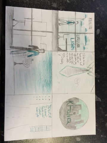
Slide 1 - Front Cover 

The main colours within this slide comes from the added strobe lighting effect placed in the top left corner. This included white and light green colours that are amplified through the change in colour balance; bringing out the white colours, and a posterise effects that adds to the luminosity of the colours within the lighting. These bright colours and use of strobe lighting creates vibrant connotations that relate to that opt a club or bar, helping to connote the themes of nightlife within the album. These references to vibrant, fun behaviour and connotations towards an exciting night life make the slide itself highly conventional towards the dance genre; the music often revolves around life settings and city nightlife, with the music often being played in clubs. This conventional use colours would also appeal to the younger target audience of 15 to 25 year olds as they are often seen to enjoy this vibrant nightlife atmosphere and club settings.
The main image within the slide simply consists of the silhouette of the London skyline. This is used to portray urban connotations and links towards the urban nightlife. The silhouette itself is brought to attention through the use of inverted colour effects allowing it to stand out against the strobe lighting and also allowing the black background to resemble the night sky. The emphasis on an urban nightlife is developed through the positioning of the strobe lighting seen to shine upon the city and develop the idea that the city becomes vibrant at night. The use of urban connotations both conveys conventions of the dance genre whilst also developing a consistency within the general artist presentation over my different media products referring to the album. The conventional aspect of the slide is developed due to the fact that the dance genre often revolves around the urban nightlife with fans of the music generally living in urban areas; also, consistency is evident through references to urban settings seen the music video and remaining slides of the digipak. Additionally to this, the slides referral to urban settings and nightlife would evidently appeal to the target audience who often live in urban areas and enjoy the vibrant nightlife.
The use of layout is evident within the slide through the positioning of the title 'urban lights'. The title itself is positioned hovering over the city skyline whilst also being underneath the strobe lighting. This is done to indicate the fact that the artists music has themes linking towards the urban nightlife and club setting; it shows the album to optimise the vibrant atmosphere in a city's nightlife. This evidently makes the slide furthermore conventional with the genre often focusing upon a club setting and urban environment. It also adds to the consistency within my media products as the artist is constantly showed to be in contact with the urban city life and the party lifestyle in clubs and bars. It further relates to target audience through showing the artist and his music to be closely connected to the urban party lifestyle that they are seen to enjoy. 
The typography and language within the slide consists of the album title, 'urban lights'. This is portrayed through the use of a bold font with the word 'urban' shown in white and 'lights' shown in a light green and blue neon font that resembles similar effects to the strobe lighting  in the slide. The white bold font with the word urban is used to relate to the skyline silhouette and the neon font for the word 'lights' links it towards the strobe lighting; this provides a visual aid representing the meaning of the title. The connotations of a vibrant club atmosphere seen through the use of strobe lighting also helps link the music within the title towards dance conventions; this is achieved through the replicated effects on the word 'lights' and the the strive lighting itself. This presentation of conventional dance music with urban themes would greatly appeal to the target audience who generally live in these areas and enjoy the atmosphere within a conventional club setting. 

Slide 2 - Personal Message

The colours within this slide consist of blue luminous colours contrasted with the formal and professional image of a shirt and tie. The purpose of these colours are to develop connotations linking towards the dance genre. Bright colours are highly conventional within this genre as they connote the fun party lifestyle that is focused upon alongside the bright neon colours seen in a club setting in which the music is played. The conventional aspects of the colours also helps appeal to the target audience of 15 to 25 year olds. The majority of this audience is seen to enjoy a party lifestyle, and aspire toward this life; by using bright colours we are able to comply with the audiences preferences in terms of their vibrant lifestyle. 
The image used within this slide includes a picture of the artists torso as he wears a shirt and the; there is also an added posterised effect used to bring out the vibrant blue colours added to the image. The main purpose of this image is to develop and emphasise a professional image of the artist. The image itself has connotations of a work, office environment. This is used to elaborate upon the artists dedication towards his music and his professionalism within the industry. Furthermore, the image is also used to link towards the video itself, plus connotations towards an urban lifestyle that is related to in the album title 'Urban Lights'. This builds consistency within the artists presentation, building up his reputation of him being a serious and dedicated artist whilst also contrasting it to his fun party lifestyle. The professional presentation and emphasis on the artists success may appeal to the majority of the target audience that are beginning work. They may aspire towards the artists success and dedication. 
The main aspect of the layout is the fact that the message from the artist is seen to cover the artists torso. It has the effect of showing the audience that the artists message is genuine and that it, generically, comes from the heart. This may have no influence on the conventional aspects of the slide; however, it may help the artist to build a relationship with his fans. The audience may feel like they can relate to artists message and appreciate his hard work that is emphasised in the message. This can help them build a relationship with the artist, allowing them to further relate to his lyrics and the music video itself.
The main aspect of the typography seen within the slide consists of the font used for the message itself. This is seen to be a handwritten font. It is used to emphasise the fact that the artist has written the message himself and directed it to the fans personally. This vastly helps the artist build a relationship with the fans as they may read the message in more detail and relate it to the lyrics of his music and the music video itself. Additionally to this, a key aspect of the language within the massage may include the use of a 'x' at the end of the message, used to resemble a kiss. This can be seen to appeal to the female audience as they fantasise about the artist and the way he treats women within the video. It also adds to the personal aspect of the video as the audience may feel that the message has been aimed towards them personally. 

Slide 3 - CD cover 

The colours within this slide consists of a variety of bright blue colours seen added to both the skyline and the water in the themes, plus a contrasted luminous white colour added to the builds. The purpose of these colours are to again build upon connotations of the dance genre. Bright colours are highly conventional within this genre as they develop connotations of the fun party lifestyle that is focused upon throughout the music alongside the bright neon colours seen in a club or bar setting in which the music is played. The conventional aspects of the colours also helps appeal to the younger target audience. The majority of this audience is seen to enjoy this party lifestyle that is conveyed through the bright colours in the side. The colours are used to relate to this atmosphere that the audience aspire towards
The image within the slide consists of a shot showing the London skyline just before nightfall; it includes icons features such as the themes, the London eye and Big Ben. There are also added effects used to show the city to be luminous and falloff bright colours. The use of the image itself is done to relate to the actual title of the album, it literally shows the 'urban lights' as it connotes the nightlife within the city. This is done through the timing of the shot, the portrayal of the London skyline and the added effects plus change in colour balances used to show the lights that connote a party lifestyle and the neon lighting within a club. This is very conventional towards the dance genre as the music focuses around this urban nightlife that is seen within the image. The urban themes and relation to the title also shows consistency within the artists presentation as we show him to be closely connected with this urban party lifestyle. Furthermore this helps appeal to the target audience as they often participate in this urban nightlife and aspire to be as renowned within the nightlife as the artist himself.  
The use of layout is evident through the positioning of the album title within the CD cover. It is seen to be positioned across the city skyline. This creates a visual meaning to the title as it is shown to be literally hovering above the 'urban lights' of London. It also helps to elaborate upon the fact that the artists music is made in relation to the urban nightlife, vastly helping to promote the dance conventions within the slide. This use of layout is highly conventional towards the genre as it shows the music to be related to an urban nightlife; this is what dance music often focuses around. The connotations centred around an urban nightlife would again appeal to the target audience as the younger adults often enjoy the cities clubs and bars at the weekend.
The use of language evidently links towards the conventional presentation of the urban nightlife through the album title 'urban lights'. The use of the word 'lights' has connotations towards the lights within a club and the bright neon lighting that is original to that environment. This makes it highly conventional to the dance genre that is mostly played in these environments. It also appeals to the younger adults who often attend these clubs and bars. The typography seen used in the presentation of the title consisted of a bold white font that stands out against the blue skyline. This elaborates upon the fact that the artist and his music epitomises the urban nightlife, meeting similar dance conventions stated above and against appealing to the younger target audience who aspire towards regularly enjoying this nightlife.

Slide 4/5 - image of artist 

Both slides four and five are used simultaneously to create a close up of the artist between them in order to show his differing attributes and personalities. The colours within slide four consist of vibrant blue colours that are developed through a change in colour balance, this is seen alongside a black and white image of the other side of the artists faced seen in slide five that is created through black and white effects; both have an added posterise effect to maintain a consistent presentation throughout the digipak. The vibrant colours added to slide four are used in order show the artists party lifestyle. The colours connote the artist vibrant personality, they also associate themselves towards neon and strobe lighting seen within a club. It emphasises the artists conventional presentation by showing him to be closely involved in the party atmosphere that the dance music centres around. This is contrasted with the colours seen in slide five; the black and white colours aim to show the professional aspect of the artists personality, helping to support slide two as he elaborates upon his dedication when creating his music. Overall the differing colours of the two images convey his diverse personality by emphasising his party lifestyle and his professional attitude to his work; this is a constant presentation of the artist as this contrast is also focused upon throughout the music video. Finally, this differing aspect of the artists lifestyle would also appeal to younger adults entering the workplace as they may aspire towards being able to successfully balance ether professional work life whilst aiming to maintain a vibrant lifestyle.
The image created between both slide four and slide five consists of a close up of the artist with a blank facial expression, looking directly at the camera. This is used to show the artist to be the focal point of the digipak, this may again appeal to fans of the artist as they fantasise about the artist himself. With the artist also looking directly at the camera fans may feel as though he is looking directly towards them; this adds to the relationship built between the artist and the audience. Additionally the blank and simple facial expressions allows the colours to clearly emphasise his versatile personality; this evidently appeals to the conventions of the dance genre and the target audience. 
The layout within the two slides consists of the fact that the the two slides are positioned so that the image comes together in order to create a symmetrical close up of the artist. This was the main way in which the contrast in personalities was developed. It made the artist the centre point of the digipak and maintained the theme of the artists diverse personality, aimed towards appealing to the target audience who aspire towards gaining this balance between professionalism and a vibrant social life. 

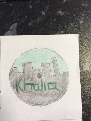
Slide 6 - Back cover, song list

The main colours within this slide that are seen in the background of the slide and the image of the gherkin consists of a variety of bright blue shades. This highlighted blue colour is portrayed again through a change in the colour balance, the variety of shades are created through an added posterise effect. The bright colours are used to convey fun and vibrant connotations whilst also showing apart atmosphere that is seen in clubs or bars. This vibrancy that is portrayed is highly conventional to the dance genre;the music often aims to develop feel good vibrant emotions that are developed through the use of the vibrant blue colours. The colouring itself is also beneficial to the development in a consistency with artist presentation; the colour blue is related to throughout my ancillaries and also seen through consistent blue tints added to the music video itself. It shows the artist as having a fun and vibrant side to his personality and music. The carless younger target audience are often seen to aim towards enjoying their lifestyle and having fun, this feel good connotations would greatly appeal to them. 

This main image within this slide consists of an image of the gherkin. This is shown through low angle to show its extravagant stature; posterise effects were also added in order to create a variety of blue shades. The use of the gherkin is slightly conventional to the dance genre due to its urban connotations; dance music is often aimed at the urban area and the clubs and bars in which the music centres around usually only appear in these areas. The use of the Gherkin furthermore adds to the consistency throughout my media products; the Gherkin is used as a setting in the music video. This allows the audience to develop links between products. The extravagance of the building also helps portray the artist success and professionalism as the Gherkin is a renowned building for business success. This artist presentation would appeal to the target audience of aspiring young adults who want to gain success quickly when entering work. 
The main feature within the layout of the slide consists of the order in which the songs are listed. The songs are listed with the more well known songs towards the top and less known songs towards the bottom. This is done in order to appeal to the consumeristic fans of the dance genre. The dance genre has a very mainstream audience influenced mostly by social media. By showing more well known songs that are often played on the radio or music channels, I can ignite an interest from the mainstream audience; making them want to listen to other songs in the album. 
The typography within the slide mainly consists of the font and its colour. The font is bold and distorted in a way that has electrical connotations; also, the font is a black colour. This black colour allows the songs to stand out; attracting the consumeristic interest from the target audience by highlighting well known songs. Also, the electronic connotations that are created from the blocked font are conventional to the dance genre with the music often being created electronically.


Strengths/Weaknesses 
I felt that during the use of Photoshop for my ancillary texts I gathered a variety of strengths and weaknesses. My strengths included my consistency with the artists presentation in my ancillaries. The consistency was evident throughout the different media products through numerous ways; the colour blue was made to be reoccurring through a change in colour balance on my ancillaries and a blue tint often added to the video, the referral to the urban lifestyle is seen with panning shots of London in the video and is also referred to in the ancillaries through images of the city skyline and iconic buildings, also, there is a general reference to professionalism in relation to the artists personality; this is seen through the artist costume in all of the media products as he often wears suits or shirts. The consistency that is evident helps viewers to create links between products that they can associate with the artist and his music; this is a very effective way of building upon his reputation.
One key weakness of mine was seen through the use of Photoshop and specifically the cropping tool. This was particularly evident in slides 3/4. Here I struggled with the use of the cropping and cutting tool when attempting to make the two slides symmetric in order create a contrasting close up made of two sides of the artists face. It took me a while to create this symmetric image, consuming a lot of my time and prolonging the process. Although I solved the issue in the end, it meant that I missed the deadline. This vastly damaged the efficiency of the process.

In conclusion, I feel that the key aspect of the digipak is its conventionality towards the dance genre. This is generally developed through the use of different shades of bright colours such as blue or green. I created these colours through a posterise effect, it adds to the vibrancy of the colours developing feel good positive connotations that builds upon a party atmosphere; of which is highly conventional to dance music due to it often aimed to create these emotions. The use of urban connotations alongside the connotations towards vibrancy and excitement would be seen as very appeal to the target audience. The younger target audience of 15- 25 often live a carefree relaxed lifestyle, aiming to enjoy themselves; the brighter colours may appeal to their light hearted nature. Also, urban connotations would appeal to the more niche audience of the dance genre who are often seen to come from urban areas, enjoying the vibrant nightlife. They would be able to relate to these urban references. Finally, the artist is certainly able to build a relationship with the fans through his portrayal of his personality. Within the didpak the artist is shown to have a contrasting personality; showing his vibrant party lifestyle next to his dedicated and professional lifestyle. This is evident in both slides 3/4. It would appeal to the audience as they are at an age of which they may be starting work life and entering adulthood; they would aspire to live the artists party lifestyle whilst also hoping to achieve his success and professionalism.

Thursday, 10 December 2015

Magazine Advert - Miss Miller


The key purpose of a magazine advert is to promote an artist’s album in order to reach a wider target audience of people who both read the magazine as well as listen to the music. It aims to act as a constant reminder of the upcoming album by appearing over a wide media spectrum. It is also used to link in with other advertisements of the album such as record labels or websites to create more marketing for the artist. Finally, it may also be used to link in with any articles within the magazine on the artist such as an interview or published scandal; this can be seen to benefit the magazine as well. The advert is specifically used, however, to develop a presentation of the artist that will appeal to a target audience for the genre; this is achieved by the portrayal of the conventions for the genre alongside features they may relate to the audience. The software that was used in the creation of this advert was adobe photoshop, this was specifically useful for its ability to distort colours in a way the I could develop a thematic use of bright colours and neon effects in order to replicate the conventions of the dance genre. After taking numerous images throughout the process of production for the music video itself, I was able to differentiate between by planned use of an office setting within the advert and a new found use of a simple close up with added effects and strobe lighting. The use of an office setting was seen to be too subversive to the dance genre apposed to the conventional use of strobe/neon lighting. The close up was made to be my final product. 

My main inspiration for this magazine advert is Example with his album 'Won't go Quietly'. Example is seen to use multiple close ups within his magazine advert. He uses them to show his light-hearted and fun personality. This is shown within my magazine advert as a close up was used with colourful effects and an added strobe lighting in order to show the artist to be closely linked to the conventional party atmosphere and club setting. The target audience may also aspire to be as closely involved with the atmosphere as the artist is shown to be.


Layout/design 

The design and layout within the advert focuses mostly around the strobe lighting added in the top left of the advert. Both the artist himself alongside the artist name is seen to overlap the  strobe lighting. Ways in which I created this over lap is through the use of layering on photoshop as I dragged the 'Khaliq' font layer over the edge of the strobe light to make it seem as though the light is shining towards his name and face. This creates a connotation showing the artist and his music to revolve specifically around the dance conventions and the club party atmosphere conveyed through the use of colours and strobe lighting. This is very conventional to the genre as it simply shows the artist and his music to be solely based upon the party atmosphere, the club setting and the urban nightlife. This would appeal greatly towards the target audience of older teenagers and younger adults as they are often the main participants in the city nightlife, attending clubs and bars at the weekend; they would then aspire to feel as involved and linked to the party lifestyle as the artist is shown to be, they could also relate the key feature of strobe lighting to the environment that they distinctly enjoy. 


Colours 

The colours used within the advert consist of a luminous neon blue seen within the strobe lighting and the effects upon the word 'lights' in the album title; there is also a use of purple and blue colours incorporated into the effects that are added to the image of the artist himself. These colours were created through identical effects added on photoshop to the font in the word 'lights' the strobe light and the artist himself; the effects consisted of a posterise effect with intensity rated at '4' and a change in colour balance used to intensify the blue colour of each layer. The use of colours have connotations towards the dance genre. The blue neon lighting has connotations towards the lighting within a blue and the vibrant atmosphere that it creates, this atmosphere is created by dance music and is focused upon within the genre. Also, similar posterised effects used upon the strobe lighting and the artist himself elaborates upon the presentation of 'Khaliq' being a conventional dance artist by linking him towards the connotations created through the strobe lighting; this being a link towards a club informant, the venue in which dane music is mostly played. The advert itself is created in reference to the younger target audience of the dance genre, consisting of young adults and teenagers ranging from 15-25. It appeals to this audience due to the conventions connotations towards a club setting through the use of strobe lighting alongside the use of bright colours and neon effects building upon the vibrant and exciting party atmosphere that artist my aim to portray through his music. The audience would enjoy the references to a club environment with them being the key age group to attend these venues; plus, they would enjoy the vibrant colours used to portray the artists vibrant lifestyle as they would aspire to live such a fulfilling exciting life at such a young age. 


Images 


The two images within the magazine advert consist of an image showing strobe lighting alongside a close up of the artist himself. The magazine advert includes half of the artist’s face illuminated in blue and purple alongside white strobe lighting matching the artists face with similar effects. . The layers were placed on photoshop in order to fabricate the effect that the light is shining on the artists face; I did this through cropping the outline of the artists face with the magic wand tool and placing it on top of the strobe lighting with identical effects including a change in the colour balance and added posterise effects. This was made specifically to be highly conventional towards the dance genre. The colours connote a fun party lifestyle that is linked with the artist in the image, plus the strobe lighting emphasises the club setting that distinctly links with the genre. The overall focus is to link the artist with the dance conventions through the use of colours and matching effects added to both the lighting and the image of the artist himself.  The images both allow the audience to relate to the advert. They can relate to the strobe lighting with connotations of a club setting which the young adults are often seen to enjoy. Plus, the use of regular work clothing consisting of a shirt and jumper combined with a blank facial expression builds upon the understated presentation of the artist being ordinary. This is then contrasted with the elaborate use of colours in order to use dyer’s theory to the effect of juxtaposing the ordinary presentation with extravagant connotations in order to create an artist image of which the audience can relate to yet aspire towards.The close up of the artist may allow the audience to build a relationship with him and aspire towards his links with a party lifestyle conveyed through bright luminous colours. By presenting him as both ordinary yet extraordinary it shows the audience that his vibrant lifestyle is achievable, making them want to aspire to be like him and experience his lifestyle through buying his music. 

Typography/Language 

The typography is made to be resemble blocks in a stand out white font; this is also seen to be combined with the use of neon effects in the phrase 'lights' from the album cover 'Urban Lights'. Although font resembling blocks links towards urban connotations, the effects added to the word 'lights' could be seen as the most effective aspect of the typography within the advert. The font itself was found on the photoshop selection labelled 'Bernhard Std Bold Condensed'; it was applied to all font with a white colour to make it stand out. Also, the effects added to the word 'lights' in the title replicated that of the strobe lighting and image of the artist; it included a posterise effect with intensity rated at '4' and a change in the colour balance used to bring out the blue outer-glow added to the font. It results in the visuals matching the content of the album by creating connotations towards the urban nightlife; this being a key conventional element of dance music. The posterising neon effects within the phrase also matches that of the strobe lighting and the image of the artist himself; it links the artist towards the dance conventions and shows the 'urban lights' to be centred around him. This comply's to the urban themes within the genre and the party atmosphere that is conveyed within the music making the advert very conventional. It also would appeal to the target audience as they may enjoy the vibrant aspects of the dance conventions whilst also aspiring to be as involved as the artist himself. Furthermore the use of language in the phrase 'urban lights' has similar effects by complying to dance conventions as it refers to the city nightlife of which the music revolves around whilst also appealing to the young audience as they are often seen to enjoy this nightlife. 

A strength within my use of photoshop was the consistency between all of my ancillary products/slides; I was able to edit images so that they have consistent effects on each, focusing around similar colours and themes. This meant that the artist was automatically linked with certain connotations; vastly helping with my artist presentation. My main weakness was the use of the cropping tool. This was seen within slides 4/5 on my digipak as it took a very long time to make the two slides create a symmetrical image of the artist; this was very time consuming and damaged my efficiency within the production of my ancillaries

The colours within the advert alongside the use of strobe lighting and the positioning of the artist himself builds upon the key dance conventions within the advert. The strobe lighting combined with the blue neon posterised colours added throughout builds connotations towards the party atmosphere and the lighting within a club; this is links with the artist as he is positioned overlapping the lighting with similar posterised effects added to his close up to show his conventional dance presentation by linking him towards the party atmosphere with a club; signified through the connotations wth the strobe lighting. Overall the conventional aspects of the advert alongside the referral to an urban nightlife helps the success of the advert, appealing greatly to our target audience for the album as the age groups of young adults and older teenagers will often aspire to live this party lifestyle whilst also participating in the nightlife itself, with young adults often being the main age group attending these venues. The eye catching originality of the posterised effects will help promote the artists music by showing it as vibrant and conventional to genre, helping appeal to dance fans specifically. However, more importantly, by making the advert relatable through connotations towards a club environment, the advert is appealing to the very large and influential mainstream audience of younger adults and teenagers; meaning that I can allow the artist to  maximise his sales.

Wednesday, 9 December 2015

Photoshoot - Miss Miller


Taking photos throughout the process of production is vital to the creating of my individual magazine advert and digipak. It allows to me specify what's needed in the projects and elaborate upon various details in the photos in order to make sure that the projects comply to my requirements set out in my planning. Furthermore, it can also be important to take a variety of photos from different angles and in different settings. This allows me to decide upon which photo may work best when trying to match the conventions of the genre and appeal to the target audience. It also allows versatility when editing the photos as you can use different effects to see what image may look best. Finally, it also promotes efficiency as it allows you to have back ups in case an image doesn't work or is poorly taken.


This image consists of the London skyline just after the sun had gone down including the London eye and houses of parliament. It was taken in order to show the London skyline and create urban connotations whilst also representing the city nightlife of which my artist is linked with. I intend to use this image on my CD cover; cropping it to fit the CD shape, editing the colours to elaborate upon the nightlife an dance connotations whilst also adding the artists name 'Khaliq' across the skyline. The editing and picture itself is highly conventional to the dance genre. It represents the London nightlife through luminous colours and the urban setting itself. This is what dance music revolves around with it mostly being played in urban clubs and bars. I feel that the best aspect of the image is its inclusion of both big ben and the London eye, highlighting the setting itself, plus the timing of the shot; it was at a time in which there was a contrast between the blue sky and the shadowed builds, it highlighted the skyline and helped influence connotations of the London nightlife. Finally, the audience will be able to relate to this impression of the London nightlife as younger adults and older teenagers often go to bars and clubs around the city.


These two images were combined in the creation of my magazine advert. One shows a picture of the artist of which I was able to edit and enhance with connotations of dance conventions. The other resembles the strobe lighting seen in a club; it was added to the advert in order to resemble a club setting. The magazine advert includes half of the artists face that is illuminated in blue and purple alongside white font and strobe lighting matching the artists face with similar effects. This was made specifically to be highly conventional towards the dance genre. The colours connote a fun party lifestyle that is linked with the artist in the image, plus the strobe lighting emphasises the club setting that distinctly links with the genre. The overall focus is to link the artists with the dance conventions through the use of colours and matching effects added to both the lighting and the image of the artist himself. With the use of basic facial expressions, clothing and a black background there was a large amount of room for editing within the magazine advert. This editing highlighted the conventions of the genre and was the best feature of the advert itself. The images both allow the audience to relate to the advert. They can relate to the strobe lighting with connotations of a club setting which the young adults are often seen to enjoy. Plus, the close up of the artist may allow the audience to build a relationship with him and aspire towards his links with a party lifestyle conveyed through bright luminous colours.

 This image consists of the artists torso as he wears a shirt and tie. It will be used in my digipak and will present the artists professional attitude and his success. The image will be specifically used present a message to the fans as he thanks them. The use of a the artists torso signifies the fact that the message is coming from the heart and emphasises that it is a personal message, helping to build a relationship with the audience. This presentation formed by the use of this image is used to show the artists success and professionalism with his work. This is subversive to the dance genre yet may also help appeal to the target audience; the target audience consisting of young adults are at often seen to be at the start of their careers, they may aspire to gain the success of the artist. It also shows the serious attitude and dedication that the artist puts into his music, the fans may also appreciate his hard work. I feel that the image is perfect for the sentimental connotations that are required in this section of the digipak as it builds various relationships with the audience through representations both professionally and personally.

My final image consists of a long shot showing regent street. This will again be used in my digipak and helps with the urban connotations as it is a iconic and busy London landmark. It will be particularly used in my slide within the digipak listing the stand out songs within the album; the image will be illuminated with effects and the songs will be listed on the skyline in a neon font. The editing to the image will be highly conventional to the genre with the addition of aluminous colours and neon font, this has connotations of the lighting within the club, linking with the party atmosphere in dance music. Also, the landmark setting represents the urban themes within the music video which are conventional to the genre with the music centred around urban nightlife. The image will appeal to the target audience due to the fact that they can mostly relate to the brighter colours and busy setting as they hope to enjoy buzzing social occasions and aspire towards a fun party lifestyle indicated by neon font and effects.  

Tuesday, 17 November 2015

Planning Digipak - Miss Miller

Planning Digipak

Digipaks are often used to present an artist’s album or single in more depth with a personal touch from the artist consisting of a message or signature. This allows fans to get a bigger insight into the reasoning behind the music and enables them to further connect with the artist. Typically the digipaks consists of a gatefold (book-style) paperboard or cardboard outer binding, with one or more plastic trays for the CD. Digipak-style cases grew in popularity among record labels and recording artists in the early 2000s, they are now used by a variety of big name artists in order to promote their large scale releases of songs and albums. Artists are often seen to either use jewel CD packaging opposed to the use of digipacks when presenting their music.

Jewel CD case


The plastic casing on the jewel CD means the paper inside is protected and will last longer. Most of the detail is solely on the front and the back, meaning that it is more likely to grab people’s attention and make them want to buy the album. Also, it will often contain lyrics of the songs included, so people who buy it will be able to learn the songs and relate to the artist more.


Digipak

Digipak’s contain higher quality images and meaning in them. They usually contain a letter/note from the artist directly to the fans, giving it a more ‘personal’ feel and sometimes they contain bonus tracks, whereas the CD version may not. The digipak has 6 sides, so there is more opportunity for visible artwork, information or promotions. This way the artist has a better chance at attracting potential buyers, as they will see the digipak as more than just a disc of music, it is a collectable item as well. A jewel case is easily ripped when removed or put back into the plastic grips, making it unappealing to remove. Also, all information is very easily accessible, making it more appealing and long lasting.
My digipak for the artist Khaliq, based on Shift K3Y, will consist of 6 sections. Within these sections there will be the cover, a message from the artist, two images relating to the themes of the music and showing the artist himself, plus the CD and song list. It will be based on the colours grey, black and white with tints of neon green throughout. Also, it will be mad in coherence to the music video and the themes within.


Colours 

Colours will have a large influence within the digipak, especially upon the presentation of the artist and the portrayal of conventions through numerous connotations that are developed. In coherence with the magazine advert for our album, the colours will consist mostly of grey, black and white with the addition of green tints throughout. The grey, black and white colours are used in order to represent the artists professional qualities, it connotes his success in a professional environment at such a young age alongside also emphasising the dedication he puts into his music. This will appeal to the younger target audience age groups who are at an age when they are starting and thinking about careers, this portrayal of success would appeal to them as they could aspire towards this dedication and power. Additionally to this, the use of neon green lighting is added to the digipak in order to contrast with the black, grey and white colours. They show the artists party lifestyle that runs alongside his professional presentation. Overall this portrays his vibrant night life in contrast to his professional work life. This is used to convey conventions of the dance genre by aiming the connotations of  the bright colour towards the party atmosphere of a club or bar that is focused upon throughout dance music. It also appeals to the youth cultures within the target audience as they aspire towards living the party lifestyle that is enticed by the artist presentation. 

Slide 1

This is the cover of the digipak itself. It is very similar to the magazine advert, allowing me to present a running theme throughout the marketing of the album. The slide shows the artists name and album name overlapping a picture of the artist in his extravagant office setting with a background showing the nighttime skyline of London. In reference to the images used, the elaborate work setting is used to show his success in reference to his job; this connotes his success as an artist and the dedication he applies to his music. This is also seen alongside the background showing the London skyline, whilst also showing his success at the heart of London, this aspect of the image also shows his link to the London nightlife, also portraying the party aspect of his lifestyle. The reference to the London nightlife is highly conventional to the dance genre, this would appeal greatly towards the target audience as they are evidently seen to enjoy a vibrant nightlife, especially at the weekends. One example of the use of design and layout within the cover is seen through the placement of the artists name. I have decided upon placing the name on top of the city skyline; this has the effect of linking the artist towards the London nightlife. This again makes the artist presentation highly conventional towards the dance genre, again appealing to our audience who aspire towards this conventional dance artist lifestyle. Although not being able to relate to the use of typography in early stages of planning, the use of language can be seen through the album title. The album states 'Urban Lights'; this is referring to the themes within the music video as it connotes the city work environment alongside the conventional London night life of which the artist is seen to enjoy. It adds to the artist presentation as it he shows him as being a stylish, modern city dweller. It may appeal to the target audience as the younger age groups often try to balance their professions or education with their social life.

Slide 2

This slide shows the message that the artist has written in order to thank and connect with his fans. The slide consists of an image of a suit overlapped with the message and a logo that resembles the artists name in a signature. The suit image background is used to the effect of portraying a professional presentation whilst also adding a personal touch to the message itself as it connotes the fact that what he said is genuinely coming from the heart. The professional presentation links towards the aspiring target audience as they aim to gain success like the artist. Also the layout of the slide, allowing the message to overlap the artists torso, may help to create a relationship between the artist and the audience as they could see it as far more personal. The typography within the slide is evident through the artists name, presented as a logo and signature. This will be created through a handwritten font, placed as a logo. The signature font is used to add to the personal touch within the message, helping the audience relate to the artist. Also, the presentation of a logo helps support the Dyer's theory as the artist aims to sell himself as a product. Finally, language is used to a certain effect, specifically within the massage seen to be written by the artist. A kiss is used to end this message, this can be seen to appeal to the female audience as they fantasise about the artist. Additionally, the font resembling handwriting will be used to further add to the personal touch within the message. 

Slide 3

Slide 3 consists of the plans for my CD cover, this will consist of a cartoon like image resembling that of a clack city with a green sky. This will be used as a background with the artists name 'Khaliq' overlapping the buildings. The image itself works in coherence with the themes of the video. It relates totally to the London Nightlife of which the artist is seen to thoroughly enjoy. The black buildings contrast with the illuminated sky in order to emphasise the vibrancy of the London skyline. This presentation of a vibrant nightlife is highly conventional to the genre whilst also appealing greatly to the youth cultures within our target audience as they appreciate this. There is also a similar use of layout here to that of slide 1 and my magazine advert. This is seen from the fact that the artists name is placed on top of the city skyline and buildings. It produces the effect of linking the artist with the city nightlife, again building upon his presentation of a conventional dance artist. This would furthermore appeal to our audience as they would aspire to have a party lifestyle like a artist is shown to have. Finally, although there is not an evident use of language, the typography within the CD cover it used to an additional effect. Although the font has not been thought of yet, I am adamant upon the use of neon lighting for the typography showing the artists name on the cover. This portrays the artists vibrant personality and lifestyle set within the heart of the London nightlife. The vibrancy is very conventional to the genre and would certainly appeal to younger age groups as they aspire to be as charismatic as him.

Slide 4/5 

These are two pictures of the artists that are added to the digipak. The pictures consists of two images that show half the artist in each in order to develop an idea upon his contrasting personalities. One image shows half of the artist wearing a suit in an empty office setting opposed to the other half showing the artist to be wearing more casual clothing in an empty bar setting. The uses of imagery, design and layout are combined here in order to create two contrasting personality that both appeal to the target audience and the conventions of our genre. One image, set in an extravagant office, shows the artists success and professionalism opposing to another image, set in a bar, showing the artists vibrant and conventional party lifestyle. The two lifestyles are contrasted through the layout of the digipak as it shows two half's of the artist; it presents him as finding a balance between hard work and a party lifestyle. This would greatly appeal to our target audience as the younger age groups, beginning to start various careers, would aspire towards this balance.

Slide 6

The final slide consists of a list showing the top, most popular songs within the album. The songs will be centred on the skyline of a famous London street at night. Parts of the buildings may be illuminated in neon green much like the songs themselves on the dark skyline. The image consists of a long shot of a busy London street showing buildings on either side. This is again used to develop upon the theme of the music video, showing the vibrancy of the city at night and linking the artist towards its atmosphere. This conventional party atmosphere is appealing for our younger viewers as they are often seen to enjoy the city nightlife. The use of layout is also evident here as the list of songs is centred between the illuminated buildings. This shows the music to be at the centre of the conventional party atmosphere within the London nightlife. It will again promote the music towards the younger age groups as they enjoy the dance music played in clubs and bars. Finally, although the language only consists of the genuine song titles', the typography and its green neon colours are used to an effect as they show the music to be part of the vibrant, conventional party atmosphere. Again appealing to fans of the music.

This planning will be highly beneficial in the process of completing my digipak. I have clear indications into the specific shots I need to take and the uses of tints I may need to find in Photoshop in order to present the conventions that greatly appeal to my target audience. This may consist of stills needed to be taken when filming of our office setting, plus shots of typical London nightlife settings and maybe a still of the bar. It has however given me an aim for the overall outcome of the digipak itself.