Digipaks are often used to present an artist’s album or single in more depth with a personal touch from the artist consisting of a message or signature. This allows fans to get a bigger insight into the reasoning behind the music and enables them to further connect with the artist. Typically the digipaks consists of a gatefold (book-style) paperboard or cardboard outer binding, with one or more plastic trays for the CD. Digipak-style cases grew in popularity among record labels and recording artists in the early 2000s, they are now used by a variety of big name artists in order to promote their large scale releases of songs and albums. Artists are often seen to either use jewel CD packaging opposed to the use of digipacks when presenting their music.
Jewel CD case
The plastic casing on the jewel CD means the paper inside is protected and will last longer. Most of the detail is solely on the front and the back, meaning that it is more likely to grab people’s attention and make them want to buy the album. Also, it will often contain lyrics of the songs included, so people who buy it will be able to learn the songs and relate to the artist more.
Digipak
Digipak’s contain higher quality images and meaning in them. They usually contain a letter/note from the artist directly to the fans, giving it a more ‘personal’ feel and sometimes they contain bonus tracks, whereas the CD version may not. The digipak has 6 sides, so there is more opportunity for visible artwork, information or promotions. This way the artist has a better chance at attracting potential buyers, as they will see the digipak as more than just a disc of music, it is a collectable item as well. A jewel case is easily ripped when removed or put back into the plastic grips, making it unappealing to remove. Also, all information is very easily accessible, making it more appealing and long lasting.
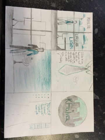
My digipak for the artist Khaliq, based on Shift K3Y, will consist of 6 sections. Within these sections there will be the cover, a message from the artist, two images relating to the themes of the music and showing the artist himself, plus the CD and song list. It will be based on the colours grey, black and white with tints of neon green throughout. Also, it will be mad in coherence to the music video and the themes within.
Colours
Colours will have a large influence within the digipak, especially upon the presentation of the artist and the portrayal of conventions through numerous connotations that are developed. In coherence with the magazine advert for our album, the colours will consist mostly of grey, black and white with the addition of green tints throughout. The grey, black and white colours are used in order to represent the artists professional qualities, it connotes his success in a professional environment at such a young age alongside also emphasising the dedication he puts into his music. This will appeal to the younger target audience age groups who are at an age when they are starting and thinking about careers, this portrayal of success would appeal to them as they could aspire towards this dedication and power. Additionally to this, the use of neon green lighting is added to the digipak in order to contrast with the black, grey and white colours. They show the artists party lifestyle that runs alongside his professional presentation. Overall this portrays his vibrant night life in contrast to his professional work life. This is used to convey conventions of the dance genre by aiming the connotations of the bright colour towards the party atmosphere of a club or bar that is focused upon throughout dance music. It also appeals to the youth cultures within the target audience as they aspire towards living the party lifestyle that is enticed by the artist presentation.
Slide 1

This is the cover of the digipak itself. It is very similar to the magazine advert, allowing me to present a running theme throughout the marketing of the album. The slide shows the artists name and album name overlapping a picture of the artist in his extravagant office setting with a background showing the nighttime skyline of London. In reference to the images used, the elaborate work setting is used to show his success in reference to his job; this connotes his success as an artist and the dedication he applies to his music. This is also seen alongside the background showing the London skyline, whilst also showing his success at the heart of London, this aspect of the image also shows his link to the London nightlife, also portraying the party aspect of his lifestyle. The reference to the London nightlife is highly conventional to the dance genre, this would appeal greatly towards the target audience as they are evidently seen to enjoy a vibrant nightlife, especially at the weekends. One example of the use of design and layout within the cover is seen through the placement of the artists name. I have decided upon placing the name on top of the city skyline; this has the effect of linking the artist towards the London nightlife. This again makes the artist presentation highly conventional towards the dance genre, again appealing to our audience who aspire towards this conventional dance artist lifestyle. Although not being able to relate to the use of typography in early stages of planning, the use of language can be seen through the album title. The album states 'Urban Lights'; this is referring to the themes within the music video as it connotes the city work environment alongside the conventional London night life of which the artist is seen to enjoy. It adds to the artist presentation as it he shows him as being a stylish, modern city dweller. It may appeal to the target audience as the younger age groups often try to balance their professions or education with their social life.
Slide 2

This slide shows the message that the artist has written in order to thank and connect with his fans. The slide consists of an image of a suit overlapped with the message and a logo that resembles the artists name in a signature. The suit image background is used to the effect of portraying a professional presentation whilst also adding a personal touch to the message itself as it connotes the fact that what he said is genuinely coming from the heart. The professional presentation links towards the aspiring target audience as they aim to gain success like the artist. Also the layout of the slide, allowing the message to overlap the artists torso, may help to create a relationship between the artist and the audience as they could see it as far more personal. The typography within the slide is evident through the artists name, presented as a logo and signature. This will be created through a handwritten font, placed as a logo. The signature font is used to add to the personal touch within the message, helping the audience relate to the artist. Also, the presentation of a logo helps support the Dyer's theory as the artist aims to sell himself as a product. Finally, language is used to a certain effect, specifically within the massage seen to be written by the artist. A kiss is used to end this message, this can be seen to appeal to the female audience as they fantasise about the artist. Additionally, the font resembling handwriting will be used to further add to the personal touch within the message.
Slide 3
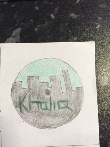 Slide 3 consists of the plans for my CD cover, this will consist of a cartoon like image resembling that of a clack city with a green sky. This will be used as a background with the artists name 'Khaliq' overlapping the buildings. The image itself works in coherence with the themes of the video. It relates totally to the London Nightlife of which the artist is seen to thoroughly enjoy. The black buildings contrast with the illuminated sky in order to emphasise the vibrancy of the London skyline. This presentation of a vibrant nightlife is highly conventional to the genre whilst also appealing greatly to the youth cultures within our target audience as they appreciate this. There is also a similar use of layout here to that of slide 1 and my magazine advert. This is seen from the fact that the artists name is placed on top of the city skyline and buildings. It produces the effect of linking the artist with the city nightlife, again building upon his presentation of a conventional dance artist. This would furthermore appeal to our audience as they would aspire to have a party lifestyle like a artist is shown to have. Finally, although there is not an evident use of language, the typography within the CD cover it used to an additional effect. Although the font has not been thought of yet, I am adamant upon the use of neon lighting for the typography showing the artists name on the cover. This portrays the artists vibrant personality and lifestyle set within the heart of the London nightlife. The vibrancy is very conventional to the genre and would certainly appeal to younger age groups as they aspire to be as charismatic as him.
Slide 4/5

Slide 6
 The final slide consists of a list showing the top, most popular songs within the album. The songs will be centred on the skyline of a famous London street at night. Parts of the buildings may be illuminated in neon green much like the songs themselves on the dark skyline. The image consists of a long shot of a busy London street showing buildings on either side. This is again used to develop upon the theme of the music video, showing the vibrancy of the city at night and linking the artist towards its atmosphere. This conventional party atmosphere is appealing for our younger viewers as they are often seen to enjoy the city nightlife. The use of layout is also evident here as the list of songs is centred between the illuminated buildings. This shows the music to be at the centre of the conventional party atmosphere within the London nightlife. It will again promote the music towards the younger age groups as they enjoy the dance music played in clubs and bars. Finally, although the language only consists of the genuine song titles', the typography and its green neon colours are used to an effect as they show the music to be part of the vibrant, conventional party atmosphere. Again appealing to fans of the music.
 This planning will be highly beneficial in the process of completing my digipak. I have clear indications into the specific shots I need to take and the uses of tints I may need to find in Photoshop in order to present the conventions that greatly appeal to my target audience. This may consist of stills needed to be taken when filming of our office setting, plus shots of typical London nightlife settings and maybe a still of the bar. It has however given me an aim for the overall outcome of the digipak itself.
You have provided a very sound analysis of your plan, explaining why you have chosen certain elements to use within your digipak, and explaining how they will appeal to your audience and follow conventions of the dance genre. You have referred back to your magazine advert and how the two ancillaries link together; however, you need to consider hidden connotations more
ReplyDeleteYou need to:
1) Think more about connotations of elements used, beyond the 'party/work lifestyle'
2) Make sure you explain all elements fully in terms of what they create for the audience and how it will help promote the artist
3) Elaborate on some of your points by explaining how you want elements used to build a relationship with fans
4) Elaborate on style of language for the personal message