Digipaks are often used to present an artists album or single in more depth with a personal touch from the artist consisting of a message or signature. This allows fans to get a bigger insight into the reasoning behind the music and enables them to further connect with the artist. Typically the digipaks consist of
a gatefold (book-style) paperboard or cardboard outer binding,
with one or more plastic trays for the CD. Digipak-style cases grew in popularity among record labels and
recording artists in the early 2000s, they are now used by a variety of big name artists in order to promote their large scale releases of sings and albums. Artists are often seen to either use jewel
CD packaging opposed to the use of digipacks when presenting their music:
Comparison of Digipak Vs CD Case
Will often contain lyrics of the songs included, so people who buy it will be able to learn the songs and relate to the artist more
Digipak’s contain higher quality images and meaning in them. Digipaks usually contain a letter/note from the artist directly to the fans, giving it a more ‘personal’ feel.
Sometimes they contain bonus tracks, whereas the CD version may not.
The digipak has 6 sides, so more opportunity for visible artwork, information (such as lyrics) or promotions. This way the artist has a better chance at attracting potential buyers (e.g. fans), as they will see the digipak as more than just a disc of music, it is a collectable item as well.
A jewel case is easily ripped when removed or put back into the plastic grips, making it unappealing to remove.
On a digipak, all information is very easily accessible, making it more appealing and long lasting.

Artist presentation/Imagery
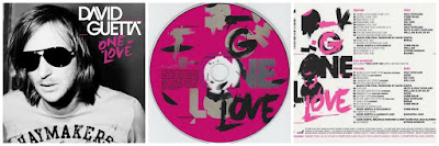
The digipak itself aims towards presenting David Guetta in a way that is both conventional to the dance genre and appealing towards his selected target audience. Although being a typical mainstream artist, often working with artists across the music industry, Guetta is specifically seen to target his self image towards younger age groups consisting of teenagers and younger adults from 15 to 25 years old. This aim is clearly evident in this digipak; more specifically, in the picture of him in the inside cover. Guetta is shown here, in a close up shot, wearing sunglasses and calmly looking away from the camera. The sunglasses could be used with connotations linking the artist to the themes of summer and the relaxed reoccurring party lifestyle that it incorporates. This seen to comply to the conventions of the dance genre as it is this party lifestyle that the music is based around. The target audience would be seen to enjoy the arty lifestyle in the summer; often aspiring to go to beach parties and clubs. Also, the artist is seen simply looking away from the camera. The fact that he is not shown with extravagant iconography, clothing or settings may have been done to appeal to the target audience as they can relate to the more down to earth personality that is presented here. The understated presentation shows the artist to be similar to the audience; it makes his lifestyle seem achievable, making the audience further aspire to be like him.
Colours/Connotations

Much like the presentation of the artist within the digipak, the digipak itself is also used in order to solely appeal to the target audience of the dance genre. Evidence of this is shown through the use of colours; the digipak uses pink colours throughout, especially on the CD itself. The CD is presented in an all pink colour with white, grey and black coloured font on top. The colour pink is utilised here in order to appeal to the conventions of the dance genre and again comply to the needs of the target audience. Pink often connotes to fun, happiness and vibrant behaviour. The colour itself is specifically used here in order to appeal to the target audience of the dance genre. The fun and vibrant connotations link towards the laid back and fun party lifestyle that reoccurs throughout dance music. Also, it appeals to the younger target audience as they can relate to this fun laid back lifestyles with little pressures and the developing party culture within this age group.
Design/Layout
Typography/Language
Finally, typography and the language used within the digipack has a great influence upon the overall presentation of the artist, the portrayal of dance conventions and the targeting towards the selected target audience. The typography within the pack is seen to be very random. This is evident on the CD and next to the song list. It could be said that this random layout of font is used to convey the fun and laid back party lifestyle that is lead by the artist and talked about within his songs. This is highly conventional towards the dance genre as it generally based upon, with the music being played in clubs and bars. Plus, it appeals to the target audience as the younger age groups that are seen as fans of the music are often seen to aspire towards this fun and relaxed life. Additionally to this, the font lost looks as though it has been painted on; this adds to the informal presentation seen within the digipak, further showing the artist to be relaxed and easy going. It would again appeal to the target audience as they would further aspire to his relaxed personality and lifestyle with little pressures and lots of excitement.
The digipak could certainly be seen as being successful as it achieves its purpose in presenting the artist as conventional DJ, having a laid back, exciting party lifestyle. This is mostly achieved through the colours which develop connotations towards fun and vibrancy; plus, the close up of the artist showing him to be wearing relaxed, casual clothing and sunglasses connoting towards the summer party atmosphere. This presentation of a party atmosphere is highly conventional to the dance genre as it is what the music mostly focuses upon with the lyrics often glorifying the clubs and bars that develop the atmosphere. This presentation of a laid back summer party atmosphere would certainly appeal to the target audience as the young adults and teenagers would aspire to live a fun laid back lifestyle with little pressures over the summer as they take a break from school or work. The presentation linking to the target audience would overall help the digipak to sell as teenagers and young adults want to experience the music that surrounds the relaxed party atmosphere.
To conclude, this research will prove to be highly beneficial when creating and planning a digipak. It shows the features of a digipak used to promote David Guetta, who is a famous dance artist, giving us clear indications of how to create a successful presentation of an artist within the genre. From the research I have discovered that artist presentation is the key feature of the digipak. It is made so that the audience can build a more personal relationship with the artist. This is evident as Guetta presents himself as being laid back and humble yet having a high social status. The key way that this presentation is developed within the digipak is through imagery and the mes en scene combined with cinematography used. This is the main way that the audience can relate to the artist and will be highly utilised as we create are presentation of shift key's high professional success and lavish party lifestyle. Two inspirations that I took from this research is Guetta's use of close ups and bright colours; these will be made evident within my digipak. The close ups allow the audience to build further relationships with the artist, also allowing me to build upon artist presentation through iconography and costume. Also, the use of bright colours develop upon dance genre conventions with connotations towards vibrancy and excitement.
CD packaging opposed to the use of digipacks when presenting their music:
Comparison of Digipak Vs CD Case
Jewel CD Case
Plastic case means the paper inside is protected and will last longer
Most of the detail is solely on the front
and the back, meaning that it is more likely to grab people’s attention
and make them want to buy the albumPlastic case means the paper inside is protected and will last longer
Will often contain lyrics of the songs included, so people who buy it will be able to learn the songs and relate to the artist more
Digipak (Special
Edition)
Digipak’s contain higher quality images and meaning in them. Digipaks usually contain a letter/note from the artist directly to the fans, giving it a more ‘personal’ feel.
Sometimes they contain bonus tracks, whereas the CD version may not.
The digipak has 6 sides, so more opportunity for visible artwork, information (such as lyrics) or promotions. This way the artist has a better chance at attracting potential buyers (e.g. fans), as they will see the digipak as more than just a disc of music, it is a collectable item as well.
A jewel case is easily ripped when removed or put back into the plastic grips, making it unappealing to remove.
On a digipak, all information is very easily accessible, making it more appealing and long lasting.
The digipak I have chosen to analyse is the album named 'one love' by David Guetta; an iconic dance artist. I have specifically chosen this digipak as it can give clear indications into what is needed for a successful dance digipak. This links in with my chosen dance artist, Shift K3Y as we can incorporate features of Guetta's digipak into his; allowing us to present him as a conventional, successful dance artist.
Artist presentation/Imagery
The digipak itself aims towards presenting David Guetta in a way that is both conventional to the dance genre and appealing towards his selected target audience. Although being a typical mainstream artist, often working with artists across the music industry, Guetta is specifically seen to target his self image towards younger age groups consisting of teenagers and younger adults from 15 to 25 years old. This aim is clearly evident in this digipak; more specifically, in the picture of him in the inside cover. Guetta is shown here, in a close up shot, wearing sunglasses and calmly looking away from the camera. The sunglasses could be used with connotations linking the artist to the themes of summer and the relaxed reoccurring party lifestyle that it incorporates. This seen to comply to the conventions of the dance genre as it is this party lifestyle that the music is based around. The target audience would be seen to enjoy the arty lifestyle in the summer; often aspiring to go to beach parties and clubs. Also, the artist is seen simply looking away from the camera. The fact that he is not shown with extravagant iconography, clothing or settings may have been done to appeal to the target audience as they can relate to the more down to earth personality that is presented here. The understated presentation shows the artist to be similar to the audience; it makes his lifestyle seem achievable, making the audience further aspire to be like him.
Colours/Connotations
Much like the presentation of the artist within the digipak, the digipak itself is also used in order to solely appeal to the target audience of the dance genre. Evidence of this is shown through the use of colours; the digipak uses pink colours throughout, especially on the CD itself. The CD is presented in an all pink colour with white, grey and black coloured font on top. The colour pink is utilised here in order to appeal to the conventions of the dance genre and again comply to the needs of the target audience. Pink often connotes to fun, happiness and vibrant behaviour. The colour itself is specifically used here in order to appeal to the target audience of the dance genre. The fun and vibrant connotations link towards the laid back and fun party lifestyle that reoccurs throughout dance music. Also, it appeals to the younger target audience as they can relate to this fun laid back lifestyles with little pressures and the developing party culture within this age group.
Design/Layout
The design and layout has a large effect upon the presentation of the digipak. Within the digipak, the design and layout is firstly used in order to maintain the audiences focus upon the CD itself with the CD positioned at the centre of the pack. This may show the audience that the music should be at the centre of attention within this digipak, taking their attention away from the artist and maybe emphasising the fact that he is a dedicated artist and humble with his work. Additionally to this, a list is used on the right section of the pack naming the songs included and, in bold, the artists that he works with. This may be used as a way of showcasing the DJ's talent by emphasising the numerous big name artists that he has worked with. This benefits the presentation of the artist by showing his versatility. The use of other artists names could be conventional to the dance genre as DJ's often try to work with successful singers/performers in order to build upon their reputation. It does also appeal to the target audience as it elaborates upon his popularity within the music industry; emphasising his social status of which they may aspire towards, plus showing his talent as a DJ which the audience may want to experience.

Typography/Language
Finally, typography and the language used within the digipack has a great influence upon the overall presentation of the artist, the portrayal of dance conventions and the targeting towards the selected target audience. The typography within the pack is seen to be very random. This is evident on the CD and next to the song list. It could be said that this random layout of font is used to convey the fun and laid back party lifestyle that is lead by the artist and talked about within his songs. This is highly conventional towards the dance genre as it generally based upon, with the music being played in clubs and bars. Plus, it appeals to the target audience as the younger age groups that are seen as fans of the music are often seen to aspire towards this fun and relaxed life. Additionally to this, the font lost looks as though it has been painted on; this adds to the informal presentation seen within the digipak, further showing the artist to be relaxed and easy going. It would again appeal to the target audience as they would further aspire to his relaxed personality and lifestyle with little pressures and lots of excitement.
The digipak could certainly be seen as being successful as it achieves its purpose in presenting the artist as conventional DJ, having a laid back, exciting party lifestyle. This is mostly achieved through the colours which develop connotations towards fun and vibrancy; plus, the close up of the artist showing him to be wearing relaxed, casual clothing and sunglasses connoting towards the summer party atmosphere. This presentation of a party atmosphere is highly conventional to the dance genre as it is what the music mostly focuses upon with the lyrics often glorifying the clubs and bars that develop the atmosphere. This presentation of a laid back summer party atmosphere would certainly appeal to the target audience as the young adults and teenagers would aspire to live a fun laid back lifestyle with little pressures over the summer as they take a break from school or work. The presentation linking to the target audience would overall help the digipak to sell as teenagers and young adults want to experience the music that surrounds the relaxed party atmosphere.
To conclude, this research will prove to be highly beneficial when creating and planning a digipak. It shows the features of a digipak used to promote David Guetta, who is a famous dance artist, giving us clear indications of how to create a successful presentation of an artist within the genre. From the research I have discovered that artist presentation is the key feature of the digipak. It is made so that the audience can build a more personal relationship with the artist. This is evident as Guetta presents himself as being laid back and humble yet having a high social status. The key way that this presentation is developed within the digipak is through imagery and the mes en scene combined with cinematography used. This is the main way that the audience can relate to the artist and will be highly utilised as we create are presentation of shift key's high professional success and lavish party lifestyle. Two inspirations that I took from this research is Guetta's use of close ups and bright colours; these will be made evident within my digipak. The close ups allow the audience to build further relationships with the artist, also allowing me to build upon artist presentation through iconography and costume. Also, the use of bright colours develop upon dance genre conventions with connotations towards vibrancy and excitement.
You have provided a very basic analysis of the digipak, explaining to an extent what some of the connotations are of the elements used; however this is incomplete as you have not covered all bullet points or considered the artist rep in a greater context.
ReplyDeleteYou need to:
1) Cover all bullet points (images, connotations)
2) Explain how the digipak is successful (or not) in terms of promoting the album and artist
3) Elaborate on all points by fully explaining the purpose of each element used within the digipak (you have summed up some very interesting points)
4) Elaborate on your summary by explaining how and why this research was beneficial, as well as mentioning any inspirations you will take on board and include within your own magazine advert (give examples)
You have covered all necessary points and explained how the digipak is successful in appealing to its TA, as well as how the research was beneficial to you; however, you still need to elaborate on certain points more, making this a sound post overall
ReplyDelete